January 2012:
In preparation of creating my own film poster I investigated how a profession film review is written and laid out. I researched the film reviews (hardcopy and online versions) of Empire, Total Film and Sight And Sound:
Conventions used in Sight and Sound:
An example of a Sight and Sound magazine film review
small pictures are used - text of the review takes up more of the page
usually 4 columns
review resembles an analysis
very descriptive plot is provided at the bottom of the page in the 'Synopsis' section
the use of technical language presents the review as having an academic tone and cold mode of address
small point size
provides additional information which is irrelevant to a reader who wants a general overview e.g. institutional information
star rating system is not used
Conventions used in Empire:
An example of an Empire magazine film review
a large image usually takes up half the page
three or more columns are used
Concluding section 'OVERVIEW' provides a quick judgement at a glance
warm, friendly and humorous tone
small point size is used but this is larger than what is used in Sight and Sound
star rating system is used
Analysis of Empire magazine's film review:
Conventions used in Total Film:
An example of a Total Film magazine film review
large images
usually, the review page is laid out with 2 or 3 columns
for extensive reviews more than half page is taken up with the text
the section 'IN SHORT' is used at the end of the review to summarise
professional, friendly tone which is occasionally humorous
a larger point size than Sight and Sound
star rating system
Analysis of Total Film magazine's film review:
After looking at all three magazine's reviews it has become clear that although Sight and Sound is very articulate and academic, the mode of address to be too formal and find it to be inappropriate for my target audience. I found Empire's overall layout and design to be most appropriate for my target audience; the humorous mode of address would best suit young adults of both genders.
February 2012:
I intended to use Photoshop to design my film review and firstly I had to select the image I wanted to place on the film review. I watched my film and brainstormed possible image stills, which I could used for the main image on the film review:
Brainstorming of images which could be used as the main image on the film review. The timings of the images on the Youtube video are in blue
I decided the image which would give a general sense of the film - but not be too revealing - and one which I could add a humorous comment to was the image of a frightened Barmaid in the alleyway at 4:43.
Original image extracted from iMovie and print screened on the Apple Mac
I then brainstormed possible humorous taglines which I could place underneath the film's title and humorous insets for the main image of Barmaid:
Brainstorming of humorous taglines to place underneath the film's title
Brainstorming of humorous insets to accompany the image of Barmaid
For the tagline which would be placed underneath the film's title I chose "When Barmaid met Boy" because this connotes a romantic relationship between the two characters but also, abiding by the Empire sense of humour, it is a play on words of the famous romantic comedy "When Harry Met Sally" - a word play which would be apparent to filmophiles.
Continuing the impression of a romantic comedy I chose "You look... different from your profile picture" to be the image's humorous inset, as the connotation of both parties willingness to enter a romantic relationship is the complete opposite of the denouement. After some consideration I decided to slightly alter the phrasing of the image inset in order to clarify that the humour is because the person at which Barmaid is looking, has given a false impression and provided her with an incorrect depiction of his looks on a dating website. So after rephrasing the image's inset became: "You look... different to your dating profile picture".
Q: In what ways does your media product use, develop or challenge forms and conventions of real media products?
Film:
Film noir typically features a femme fatale character - my female protagonist 'Barmaid' has a generic femme fatale quality in that she is feisty, which can be seen from the bar scene as she does not let the male overpower her. This is similar to the way Phyllis in "Double Indemnity" overpowers Walter through her language - showing the femme fatale not to be a subordinate woman.
Film noir is shot in black and white whereas my film is shot in colour
Film noir typically features a male character as its anti-hero - this can be seen in films such as "The Big Heat" and "Body Heat" - whose path to resolution is made through corruption or morally questionable acts. This happens in my short film as Boy is ultimately wronged by Barmaid and the path to a resolution, in Boy's mind, is to confront Barmaid and intimidate her. The anti-hero stock character blurs the boundaries of a hero and a villain, which is also done through my film's ambiguous ending as it is left unclear what happens following Boy's final line "I'm sure your flatmate can wait a while".
My film challenges the forms and conventions of not only Film Noir but films in the general sense through the lack to the nameless protagonists.
Generically in film noir, there is a theme of alienation and paranoia which features in my film. Boy is alienated from his fellow man as he is rejected from the pub - for me, this represents the rejection by social groups in the human and animal world who, if felt they are not provided with enough information on an outsider, will reject the outsider causing further alienation. This rejection causes Boy to follow Barmaid home and his paranoia is revealed as he says "I know you didn't mean to hurt me". This reveals that Boy has a paranoia of people intentionally causing him harm which worsens with his alienation.
Violence is a generic theme in film noir - a theme which is shown explicitly. Although violence does not explicitly occur in my narrative, the ambiguous ending along with the police sirens could connote violence. In this case, I think it possible to say I both challenge and conform to the forms and conventions.
Boy's clothing challenges the conventions of the film noir male protagonist. Unlike film noir protagonists, Boy does not wear a suit and hat as he is not a detective or involved with the law - this was the usual occupation of the film noir anti-hero. Boy wears a chequered lumberjack shirt, jeans and Converse trainers, which is the typical attire of young men in the 21st century.
Barmaid's costume is synonymous with that of the film noir femme fatale. Typically the femme fatale wore dark clothing which was often sexualised and feminine make-up which always usually included red lipstick. In the middle and right windows of the femme fatale montage (below) you can see the femme fatale wore a black coat - which was usually knee length or lower - and their hair was kept down.
A montage of the generic costume of a femme fatale The left and middle window features Gloria Grahame playing Debby from "The Big Heat" (1953) and the right window features Barbara Stanwyck playing Phyllis from "Double Indemnity" (1944)
A montage of the clothing worn by Barmaid in my short film, which resembles that of the femme fatale Barmaid is wearing a dark full length coat (below), red lipstick, eye make-up and is wearing her hair down
Film Poster:
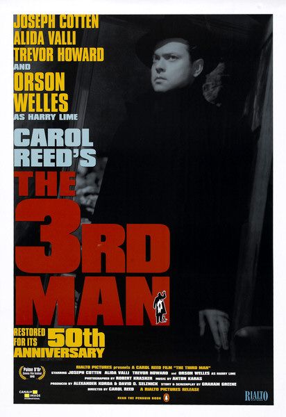
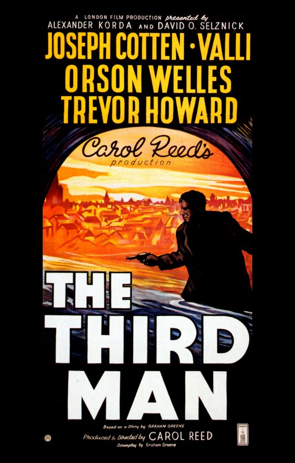
The lone male on the film poster is a typical framework for film noir posters e.g. "Brighton Rock", "The Third Man"
Like many film noir posters, there is a strong contrast between the use of light and darkness. Having said this, my film poster is also contemporary in the use of the institutional information provided towards the bottom of the page and using a photographed image and not a painting which has been used in many film noir posters such as "The Dark Corner" and "The Postman Always Rings Twice"
My poster subverts the codes and conventions associated with modern film posters as it does not have a web address available. I done this purposefully in order to comply with the generic codes and conventions of the film noir posters.
The only identifiable colours from the original image are the monotone colours (white, grey, black) which uses the conventions of film noir posters
Many noir film posters feature a dark background with a lighter figure. I have kept to this convention through the use of a black background and, through the use of artificial light, have lit the figure in the poster.
However, I have not entirely lit the figure in my poster so in this way I am challenging the conventions.
Film Review:
My film review Empire magazine's film review
I looked at the codes and conventions used in Empire magazine's review and based my film review layout upon that of Empire.
I included the features such as the layout of the text and the image, the position of the verdict box - although I called it 'OVERALL' in order to create my own film review within the conventions of Empire's layout - the position of a rectangular box to the left of the main image and a humorous image inset.
I have challenged the conventions in the form of placing the film's institutional information in the box to the left of the main image and not under the film's title, using 3 columns and not 4, placing my text selection from the review in the centre of the 2nd column and not at the bottom of the left hand side of the page
In order to have a continuous colour scheme through my media products I chose a black, red and blue colour scheme.
I feel I have equally challenged and conformed to the generic codes and conventions of film reviews as I followed the general layout but altered the positioning of certain elements.
However, I find it extremely unlikely that well-known film review magazines would devote an entire page to review a low-budget, independent film. If independent films are reviewed they are usually done so using half a page with a less extensive review which I have done in my review.
Q: How effective is the combination of your main product and ancillary tasks?
All three of my products follow the same colour scheme, which gives a sense of collective identity. All my products feature the colours red, black, blue and small references to yellow. In my main product, red is is the colour of the nail varnish and lipstick worn by Barmaid. This is a key colour in terms of noir as red has connotations of violence, sexuality, danger and death. Black is a dominant colour as Barmaid's entire costume - except the lipstick and nail varnish mentioned above - and, as the film is set at night, every scene is dark and black. Black has connotations of mystery, corruption and death. An example of how I have used the dark effectively in my film is the moment Boy steps away from the shadows and into the light. This is symbolic of Barmaid's 'death', the revelation of the identity of her stalker and, whilst in the light, Boy shows his mind to be corrupted with insanity. Blue does not heavily feature in the film as, at some points, the darkness of the sky appeared to contain blue-ish pigments. Typically blue is associated with the male sex, which only features slightly but it is an constant motif. The continued appearance of the blue is symbolic of the constant presence of the patriarichal values which govern society. Yellow, or light, features in the film as there is a constant presence of yellow-ish light: street lamps, the light upon Barmaid's face in the alleyway, the light in the pub's interior. On my film poster red is the colour of the font for "i.D." which is the largest font used on the poster, and the "Palme D'Or Short Film" text. Black is an integral colour of the poster as it is the colour of the background and, thus, the most dominant colour. Blue is the colour of some of the text on the right hand side of the poster and its feature on the poster was influenced by the "The Third Man" poster. Blue also features on the logo of Lens Entertainment Productions, which I created on Photoshop. Yellow is the colour of the Palme D'Or logo and of some of the text on the right hand side of the poster. Myy film review features red as it is the colour of the masthead's background, the star-rating's background and the tagline text. Elements of black feature in the main image and is the colour of the text used in the columns, as well as the stars in the star rating system. Blue is the colour of the rectangle which is the background for the institutional information and the colour of the selected text in the middle of the second column. Blue also features on the star logo I created using Photoshop, which is at the top of the page and also features the colour yellow.
I believe there to be the same tone and ambience in all three of my products. The film has both black comedy and thriller moments. Black comedy is present from the Irish pub music coming from the pub's interior just as Barmaid has left and Boy is in hot pursuit. The lyrics "Oh my lovely rose, you're the sweetest girl I know" connotes romanticism, which is darkly comic considering the ending of the film and Boy's intentions. Towards the end of the film, when Barmaid is certain she is being followed, she attempts to run from the clutches of the pursuer. Thriller is established through the audible heavy breathing and handheld camera work. Both these elements of black comedy and thriller arouse a sense of fear and terror through sympathy for Barmaid. The threatening look from the male protagonist on the film poster evokes a sense of fear from the intimidating and cold glare he is giving the view. Fear is also seen in the facial expression of the female protagonist from the image used in my film review. Although this tense mood is uplifted by the humorous image inset "You look... different to your dating profile picture".
So, I find all three individual products to induce the same intended trepidation.
Q: What have you learned from your audience feedback?
Target Audience:
Aged 16 - 25
Both genders
Middle and working class
Mixed ethnicities
I received both positive and negative feedback from the paper based questionnaire and the video log which features me interviewing 3 people - with the same questions as the paper based questionnaire - who have seen the film.
Positive:
Positive representations of females - subverts the stereotype of the meek woman - the power struggle between the two protagonists means there is a balance of gender representation
Good build up of suspense
Piano soundtrack made the stalking sequence more sinister and helped to create a spooky ambience
The piano music fitted well with the chase sequence
Handheld camera work made the stalker more threatening as the viewer could not see him
Realistic setting - made the film more credible
Clear narrative - was understood that the ending was left ambiguous intentionally
Variety of locations made the film seem more professional
Good range of camera shots and angles
Negative:
Bad filming quality made the film look low budget
Film not seen as realistic as it is centred around an unrelatable subject
Plot is unrealistic
Better continuity throughout
Music should flow better and not be so fragmented
Handheld camera was too shaky
Camera was not in focus all the time
Conclusion:
I found that only the female viewers, with one exception, found Barmaid to be a sympathetic character and so they enjoyed the film more so than those who did not have an emotional response. This indicates that my initial expectations of the target audience was incorrect.
I found the majority all agreed that the plot was unrealistic in the sense that it was centred around an unrelatable subject - the stalking - but found the beginning very realistic as my target audience are those who socialise in mature environments and are the people who do get asked for i.d. frequently. This allows me to conclude that I should start, finish and end with a subject or issue which can be related to my target audience.
I found that no-one who completed my questionnaire were able to identify codes and conventions of film noir, so this aspect of my film went unrecognised - although one person did compare my film to be in the style of the TV neo-noir drama "Whitechapel". A high majority of my audience feedback stated that my film was considered to be of the Thriller genre. This leaves me to conclude that it would be most appropriate to show my film in an arthouse or independent film festivals and cinemas such as The Pheonix Cinema in East Finchley.
I received mixed feedback regarding my soundtrack. Although it was unanimously agreed that the used and tone of both pieces of music worked very well in their respective placements, most agreed that the music would've been better if the loop was not so fragmented and flowed into each loop better. However, having this been said, some of the same people who made this critique then stated that despite the fragmented soundtrack, it added to the overall eerie feel of the chase sequence - so I had very conflicted views regarding the soundtrack.
The audience feedback left me to conclude that my target audience should've been female, younger and of narrower age gap. However, I received the same responses from different ethnicities and social classes (the middle and working classes) so I came to conclude that I did not need to change these elements of my target audience.
Q:How did you use new media technologies in the construction, research, planning and evaluation stages?
Construction:
I used a digital camera to record my film footage
I used an Apple Mac computer to upload my footage onto iMovie - the Apple software which I used to edit my film and my questionnaire feedback (which I recorded on the Apple Mac's build-in camera)
As I do not own an Apple Mac at home and as my computer does not have any software which would allow me to edit my film, I could only edit my film on the Apple Mac computer which was available at school
In order to create a piece of original music, I used GarageBand software on the Apple Mac to create a loop
To capture the image for my film poster I used the same digital camera that I used for filming
I used Photoshop software to create my film poster and film review
To capture the image from my film and use it for my film review, I print screened the image as it appeared on iMovie. From here, I was able to paste the screen shot onto Photoshop, crop the image from the rest of the screen shot and paste the selected image onto another Photoshop tab and I began creating my film review.
Research:
In order to research the generic codes and conventions of film noir I watched film noir and neo-noir films on DVD
I used the internet to further research the films I had seen (Wikipedia, IMDB) and to further identify generic codes and conventions of film noir (Youtube videos)
Planning:
In order to establish my target audience, I created questionnaires using Microsoft Word 2007 on my home computer and distributed them to various family members and school peers.
To create my anamatic, I used a digital camera to record images I drew onto a paper based storyboard, which I then edited using iMovie and published onto Youtube.
I used Microsoft Word 2007 on my home computer to create the call sheets for my production. I then print screened a call sheet and pasted onto Paint where I was able to make the call sheet into a JPEG file - a suitable file which I was able to upload onto my blog
I created my brainstorm spider diagrams using Paint. I typed the text and created the shapes on paint and then saved them all as JPEG files, which I was then able to upload onto my blog.
I captured my cast and location shot images on a digital camera, which I uploaded onto iPhoto and from there was able to upload the pictures onto my blog.
Evaluation:
I used the internet to access my blog, where I recorded my progress.
I used the internet to research images of femme fatales, copied and pasted the images onto Paint where I created a montage of pictures - using the cropping tool - to depict the femme fatale costume.
I print screened stills of the Youtube video of my film and pasted the images of Barmaid to Paint where I created a montage of different camera shots - using the cropping tool - to show her costume in the film.
Film Poster Analysis: In preparation for designing and producing a film poster for my short film I researched generic conventions of modern film posters:
film title has the largest point size on the poster
names of famous members of the cast have a smaller point size than that of the film title
usually, the main image which provides the background has been digitally manipulated
tagline
logos of festival screenings and awards
quotations from reviews
address for the film's website
institutional information towards the bottom of the film poster
I researched classic noir and neo-noir film posters in order to gain a better knowledge of what elements should be present in my film poster.
Classic Noir:
Neo-Noir:
Film noir has always be considered a sub-genre of crime or thriller, and as my short film has been associated with having thriller elements by those who answered my questionnaire, I researched film posters of the crime and thriller genre from the 1940's till the present day:
"Kiss Of Death" (1947)
"Brighton Rock" (1947)
"The Third Man" (1949)
Scarface (1983)
The Untouchables (1987)
What Lies Beneath (2000)
Mulholland Drive (2001)
Swordfish (2001)
Along Came A Spider (2001)
Sin City (2005)
Max Payne (2008)
Law Abiding Citizen (2009)
I chose to do my film poster in the style of 'The Third Man' but wanted to photograph an image for my film poster in the style of the males on the posters of 'Brighton Rock' or 'The Third Man'. When I had my film poster shoot, I alternated the orientation of landscape and portrait and changed the position of the white light - which originated from an iPhone.
The original image I selected for my poster
I used Photoshop on the Apple Mac and added titles such as cast credits, film title, tagline, institutional information and date of release in Impact font.
I further researched conventions of film posters by researching independent film festivals. Independent film festival recognition is found on any independent film poster. While researching I came across Bird's Eye View Film Festival which is based in London and recognises the achievement of women directors - I felt this to be an extremely apt Film Festival to include on my film poster.
Bird's Eye View Film Festival logo
I uploaded the image onto Photoshop and changed the colour of the logo to orange as I felt orange suited the colour scheme of my film poster better. I researched the categories of awards and felt that the Best Newcomer award was most suited for my film so I added the words 'Best Newcomer 2012' in orange font below the orange logo and changed the white background to black. I then copied and pasted this onto my film poster
I also found through my research that Cannes Film Festival presents the Palme D'Or for Short Film Award. I searched an image of the logo for this award, which is used on winners' film posters:
The Cannes Film Festival Palme D'Or Award for Short Film
I uploaded this image onto Photoshop and changed the colour of the font to red. I then changed the background to black and used the paint bucket icon to fill in each gap of the Palme D'Or logo and the words below the logo. After I had done this I copied and pasted the new image to my film poster, which was now complete.
October 2011:
After having watched many classic noir and neo-noir films I brainstormed possible plots for my short film.
I had decided to use the plot - which is highlighted above - with the setting of a public house. Fortunately, my father is a manager of a public house in Ladbroke Grove (W10) and I was granted permission to film there.
Then, I brainstormed possible names for the title of my short film:
From the brainstorming, I concluded that the most appropriate name for the short film is "i.D." as the lack of I.D. is the way in which the two characters meet and this relates to the subject of identity which is present in noir films - e.g. the hero is also the anti-hero, there is a crossing of boundaries and an unclear identity.
When considering who I shall cast the most apt decision was to cast my younger brother Conor and friend Rebecca. This is because Conor visits my father with me so getting to the location would not be an issue and he is studying Drama GCSE at school and Rebecca has an interest in acting.
With my plot, location and cast established I completed a storyboard of the film's plot and created an anamatic, which I published onto Youtube:
My anamatic from Youtube
Source:http://www.youtube.com/watch?v=VKBgxA1vKTk In order to discover a route for the characters which would would be longer than the 5 minute minimum and one which would allow for discretion as I intended to give an atmosphere of isolation, I investigated the Ladbroke Grove area by walking different routes. Afterwards, I had finalised the route the characters would take during the film: Key: Purple circle = location of pub
Red star = starting location of film
Blue path = female protagonist's path
Black path = male protagonist's path
Red cross = location of the film's ending - where the two characters meet November 2011:
In preparation for filming, I considered any props, constume and equipment I shall wish to use to complete the film so I researched make-up and clothing typical of 1950's female icons:
Elizabeth Taylor:
Marilyn Monroe: Grace Kelly:
Brigitte Bardot:
Common qualities of the Film Noir woman:
Red lipstick
Heavy, black eye makeup
Sexualised attire - e.g. plunging necklines
Black and red are the most common featured colours in clothing and makeup
Below I created a mood board of ideas for Barmaid's costume:
Cast and Location Shots:
The cast and myself agreed that only weekends (Friday night to Sunday early evening) were appropriate for filming as it would not interfere with our schooling so I created a calendar to calculate when we shall be able to film:
Key: Blue squares = times Conor is unavailable
Purple squares = times I am unavailable
Green squares = times Rebecca is unavailable
So it was decided that we would begin filming on Friday 25th November. However, as I wanted dry weather conditions for filming, the filming was cancelled due to a large amount of rainfall. So filming was postponed to the following Friday.
Friday 2nd December 2011
I captured still images of the cast and of the location (Ladbroke Grove).
In order to reach my chosen audience, I cast a 15-year-old Irish male and a 17-year-old dual-heritage British female. I chose to cast my brother Conor to play the male protagonist as he is currently completing a GCSE in Drama. Production:
Friday 2nd December 2011
Call Sheet for Friday 2nd December 2011
I started filming in Ladbroke Grove. I captured the entire storyline of the film on that one occasion. Whilst filming I decided to slightly alter my original story as whilst filming I captured police cars - with their sirens on - passing when the cast and I were filming the ending scenes, so I felt I should take advantage of this footage by giving the film a more sinister ending. Shortly afterwards, after we had just finished filming the final scenes, it began to rain and the rain caused a 'floating light' effect on the camera; this is the first image seen on my final film product.
Tuesday 6th December 2011:
I uploaded the camera footage onto iMovie on the Apple Mac and began to select the parts which I wanted to include in the film.
Friday 9th December 2011:
After identifying the film footage I wanted to include in my film's title sequence, I began to create my title sequence. I experimented with the speed of the footage and found the slow-motion footage shown at the beginning gave a haunting ambience. The footage I placed in the title sequence features people mindlessly walking past and Conor is in one of the shots and not in the next. This was filmed unintentionally as I had originally wanted to show him arriving from the station to the pub but, as there was a large crowd passing, I filmed the crowd instead and Conor got caught in the shot. When adding the titles, I experimented with different fonts and colours.
Tuesday 13th December 2011:
After editing all of my current footage I noticed: there were times when the actors' voices were drowned out by the music coming from the jukebox, the quality of acting was poor, the focus of the camera faultered. The most important error was I could only accumulate a maximum of 4 minutes of film footage - less than the required 5 minutes. Also, I felt I neglected the build-up of the stalker sequence towards the end of the film. Thus I arranged another date to re-shoot:
Key: Blue square = Conor unavailable
Purple square = I am unavailable
Green square = Rebecca unavailable
Red square = we are all unavailable
We thus decided to re-shoot on Friday 16th December 2011.
Friday 16th December 2011:
I re-filmed the bar scene, the concluding scene and experimented with camera shots and angles for the outside scenes. There were continuity errors as Conor's shirt was in the same style but in a different colour than the first and Rebecca's hair did not have a clip in it to give the half up-do style she was seen with before.
However, I was unable to finish the concluding outdoor scene as it began to rain, which meant I had to reschedual with the cast:
Key: Blue squares = Conor unavailable
Purple squares = I am unavailable
Green squares = Rebecca unavailable
Due to time constraints I was forced to film both Conor and Rebecca separately, which is why Conor is not seen during the stalking sequence. As I wanted to film as soon as possible, I stayed over Rebecca's house on Thursday 12th January and filmed her part and I filmed Conor's part in our back garden on Sunday 8th January.
Friday 6th January 2012:
I uploaded the new footage and began editing. As I had only new footage of the pub scene I could only focus on editing that scene - both the previous and new footage. I had several versions of which shots to use in the indoor pub scene.
Sunday 8th January 2012:
I wrote the script beforehand and as Conor was saying his lines to the camera, I read Rebecca's lines. On this day of filming it was snowing so I filmed Conor under the roof of our shed in the garden - this meant that the snow was not visible and thus wouldn't cause any continuity errors. As we were filming in the evening, I found that Conor was barely visible on the camera so I had to keep the motioned sensor light - which is at the end of the garden - on constantly for the 20 minutes it took to film, so the camera was left standing on a tripod. I had decided beforehand that I wanted Conor's dialogue to be filmed while the camera was on a tripod because the camera - in this instance - is acting as a point of view shot from Rebecca's character. The steady shot would connote Barmaid's mental stability and the shaky handheld I would go on to later use to film Rebecca's dialogue would connote Boy's mental instability and fragility. I also wanted to reinforce Boy's insanity to the viewer by presenting his dialogue scene as fragmented.
Having already done my film poster research, I knew that I wanted Conor to be on the film poster and so took this opportunity to capture still images for my film poster. I had the concept of immitating the film posters of "Brighton Rock" and "The Third Man" because the respective male protagonists have serious facial expressions, which could be perceived to be intimidating (to influence by evoking fear) - I consider fear and intimidation to be a central emotion and theme to my short film. In order to have a gradient of light to darkness, I used Conor's Apple iPhone - which has an App that projects a white light - to light different sides of his face.
Tuesday 10th January 2012:
I uploaded the footage of Conor's scene and found that the brightness was low so I experimented with the colour filter and the brightness and contrast levels.
Thursday 12th January 2012:
This time I filmed the stalker sequence in Enfield and had to be cautious not to frame anything which would reveal the location as - for continuity purposes - I wanted the viewer to believe the location to be near Ladbroke Grove. I found the location more apt for a stalker sequence as there were many narrow alleyways, which meant that it was unlikely a member of the public would appear in the film and continuous silence could be established; these elements highlight Barmaid's vulnerability as she has helpless and cannot receive any help. As I was filming Boy's point of view shot whilst stalking Barmaid, I used the handheld camera for the entire sequence.
I recalled my research into suspence sequencing at the beginning of the academic year and placed different false climaxes within the film. This constant anticipation builds up the tension to provide a shocking climax.
When filming I found the sequence to be somewhat monotonous so I asked Rebecca to have a telephone conversation with her 'flatmate' - the conversation which is on the final version of the film was entirely improvised. I also wanted a reason to be provided as to why the police cars would be shown in the film; the police cars connote that they have been contacted regarding Barmaid's assumed disappearance and I thought if Barmaid was living with a flatmate then this provides an explanation.
Despite not having originally planned this, during filming I told Rebecca to film her character's point of view. For all parts of the stalker sequence I filmed the same parts three different times to provide: a stalker point of view, victim point of view, general camera overview.
Friday 13th January 2012: I uploaded the footage of Rebecca, the stalker sequence and the ending and began sifting through which footage I would be using.
Friday 20th January 2012:
I arranged all the footage into chronological order and began integrating footage from all four filming occasions. I spent most of the following week working on the conversation between Conor and Rebecca as I feel this to be the climax of the film. Friday 27th January 2012:
I found the lighting to be an area that needed many alterations. The first alteration which needed to be made to the lighting was the scene which included Barmaid's telephone conversation with her flatmate. To resolve this problem, I experimented with the colour filter and brightness and contrast levels. I found that the colour filter made no improvement upon the visual clarity and so I decreased the contrast and increased the brightness, which I found resolved the lighting difficulty.
The second alteration was completed when I noticed that the lighting was different in Rebecca and Conor's scenes individual alleyway scenes. Conor's scenes, despite altering the brightness and contrast previously, to be a different colour filter from the yellow colour filter in Rebecca's scene. I made Conor's scenes more yellow but, as I had already finely cropped the timings for the dialogue, I had to change each individual clip to the same colour filter which was a challenge and time consuming. Another issue I encountered was the difference in volume - Rebecca's dialogue was quieter than Conor's dialogue so I adjusted Rebecca's dialogue to 200% for each of her clips.
Tuesday 31st January 2012:
I had completed editing the film footage and re-watched the film in order to check for any visual or aural errors.
Sound:
Friday 9th December 2011:
When creating my film's title sequence, I searched the iMovie music database as I wanted to create a mysterious ambience. Having found a piece of music I liked and found apt for the short film, I placed 'Drone Dark Suspense' in the title sequence.
Friday 16th December 2011:
In preparation for the production of an original piece of music, I brainstormed melancholic songs - which I found to be best suited given the film's denouement - which I could manipulate to create a loop on GarageBand:
I had already imagined some piano chords being played in the stalker sequence and when I listened to 'Bring Me To Life' by Evanescence I knew the into was the piece to put in the stalker sequence. The song's intro is mysterious and eerie, which is what I intended the stalker sequence to be. I found it difficult to perfect a loop of this intro and make one note from the end of a loop flow into the beginning of the next.
I also chose to include 'Hello' by Evanescenece as the beginning note is very haunting and an apt accompaniment to the ending credits as the music - along with the police sirens - connote a violent attack of some sort has been made on Barmaid and the music of 'Hello' establishes a melancholic ending. Friday 20th January 2012:
As I was nearing the completion of my short film, I uploaded 'Hello' and 'Bring Me To Life' by Evanescence onto GarageBand and began to manipulate both respective intros into a loop.
Wednesday 1st February 2012:
The creation of the loops for 'Hello' and 'Bring Me To Life' were completed. I re-watched my film footage of the stalker sequence in order to pin-point the location where the accompaniment of the loop of 'Bring Me To Life' would be most apt. After doing so, I placed 'Bring Me To Life' in the decided upon positions.
I placed 'Hello' at the end of the film footage so it acted as a sound bridge from the film to the ending credits. I altered the ending credits after researching the ending credits of short films such as 'Virus'.
Friday 3rd February 2012:
I created the loop for 'Bring Me To Life' and placed it in the stalker sequence. When replaying the sequence I found some clips that were slightly out of sync with each other - i.e. one clip did not flow perfectly into the next - so I corrected these errors. After watching the film three times to ensure it was faultless, I concluded the editing of my film and published it to Youtube.
However, I encountered a problem when publishing my film to Youtube. As "i.D." is a popular video title on Youtube, I found it impossible to find my film when using the search engine so I published the video entitled "i.D. Lights and Frights", which references to a possible title for my film I came up with when brainstorming.
I then went on to show fellow Media Studies students and friends my short film and asked them to answer my questionnaire. I recorded their responses on the built-in camera on the Apple Mac and edited the footage using iMovie:
I asked 10 other people who have seen my film to answer the same questions as asked in the above video on a paper-based questionnaire.
My paper-based questionnaire
I used Microsoft Excel to generate bar graphs and pie charts to illustrate the results of my questionnaire:
1. a) State age and ethnicity
Bar graph representation of the ages of those who completed my questionnaire
Bar graph representation of the ethnicity of those who completed my questionnaire
1. b) Male or Female?
Bar graph representation of the gender of those who completed my questionnaire
2. Did you enjoy this film?
Bar graph representation of the response to the question: "Did you enjoy this film?"
Those who answered 'Yes' stated:
"The girl's footsteps built up the tension as it emphasised her isolation and vulnerability"
"There was a good build up of suspense"
"The setting of Ladbroke Grove made the film realistic"
"The piano soundtrack made the chase sequence, and the build up to it, really sinister"
"I liked the handheld camera work as it made the viewer on edge because you knew the girl was being followed and the guy was more threatening because you couldn't see him"
Those who answered 'No' stated:
"I don't like short films"
"It was obvious it was low budget so I didn't enjoy the viewing experience but I thought the build up of the climax was good"
3. What genre would you associate with this film?
Bar graph representation of the response to the question: "What genre would you associate with this film?"
4. Did you find the gender representations stereotypical?
Bar graph representation of the response to the question: "Did you find the gender representations stereotypical?"
Those who answered 'Yes' stated:
"The boy was dominant for most of film - this began as he waited outside for the girl as from that point onwards he is controlling her fate"
"Even though the barmaid is overpowering in the pub scene this is only because she works there and there's lots of people around - most of whom are men - so she took advantage of her status there. Because of this I didn't find this to subvert the gender stereotype."
"The fact there is a barmaid, who serves the patriarchy through her role as a sexual object and servant, is stereotypical"
Those who answered 'No' stated:
"The boy began as inferior to the girl as in the pub she was in control"
"When the barmaid humiliates the boy she's not sweet or particularly feminine so she assumes a masculine role in a masculine environment (the pub)... subverts gender stereotypes because you would assume if a woman was in a male environment she'd have a greater desire to establish her femininity, which the barmaid in the film obviously doesn't do"
Those who answered 'Yes and No' stated:
"There was a balance as the girl was in charge at the beginning and then in the final scene the boy exerts his dominance by stopping the girl from leaving and intimidating her"
"It was not stereotypical in the beginning because the girl humiliates the boy but then it is stereotypical as the boy takes charge by frightening the girl and, we can only assume, through violent or sexual means"
5. What did you think about the role of the setting?
Bar graph representation of the response to the question: "What did you think about the role of the setting?"
6. Did you find the film realistic?
Bar graph representation of the response to the question: "Did you find the film realistic?"
Those who answered 'Yes' stated:
"The i.d. situation was realistic as that happens to people all the time who are around 18 years old. And it was realistic that the boy was annoyed and stormed out"
"The realistic setting makes the film more credible"
Those who answered 'No' stated:
"I've never been stalked so the boy stalking the barmaid after their altercation seems unrealistic, but although it does happen in real life, it is not realistic to me"
"I can sort of believe that the boy follows the barmaid to settle the score because he's shown to be a bit insane and unhinged in his conversation with her but I don't find it realistic that he would stalk her for such a long time"
"I'm not used to it [stalking] in real life so I can't really relate to it"
7. Did the film come across as professional? What made you conclude this?
All those who completed my questionnaire provided balanced answers - below are quotes from some responses:
"The different locations made it seem professional as you'd assume the budget was larger than if it was in the same location"
"The range of camera shots and angles make it clear that you've been educated in cinematography and you have a good range of knowledge and you didn't just randomly film"
"The quality of the camera was obviously from a cheap digital camera so that gave the impression of an amateur film-maker but the different camera techniques and shots conflicted with this amateur impression"
"I thought the in and out of focusing was really good so you seem to have good technical knowledge about editing films"
"I thought the acting was ok, nothing special, and the camera that was used was clearly not that of a Hollywood film standard because it was a bit pixilated at times so I thought it came across as more amateurish"
8. Was the narrative clear?
Bar graph representation of the response to the question: "Was the narrative clear?"
9. What did you think about the use of non-diegetic sound?
"The piano made it seem spooky and added to the ambience"
"The repetition of the piano foreshadowed the confrontation between the boy and the barmaid... it reminded me of 'Jaws' in the way that the more the music played the closer the climax was"
"The music fitted well with the sequence and so I thought it was a very good choice to place in the chase sequence"
"I really liked the music at the end because it starts off really creepy and leaves the viewer unsettled because the ending's left open and the police cars and ending music suggests that the boy killed or raped the girl"
10. Did you have an emotional response?
Bar graph representation of those who had an emotional response to the film
11. Did you find any camera angles or movements to be sophisticated?
Pie chart representation of the response to the question: "Did you find any camera angles or movements to be sophisticated?"
12. What could be done to improve the film?
Pie chart representation of the response to the question: "What could be done to improve the film?"