In preparation for designing and producing a film poster for my short film I researched generic conventions of modern film posters:
- film title has the largest point size on the poster
- names of famous members of the cast have a smaller point size than that of the film title
- usually, the main image which provides the background has been digitally manipulated
- tagline
- logos of festival screenings and awards
- quotations from reviews
- address for the film's website
- institutional information towards the bottom of the film poster
Classic Noir:

Neo-Noir:
Film noir has always be considered a sub-genre of crime or thriller, and as my short film has been associated with having thriller elements by those who answered my questionnaire, I researched film posters of the crime and thriller genre from the 1940's till the present day:
"Kiss Of Death" (1947)

"Brighton Rock" (1947)

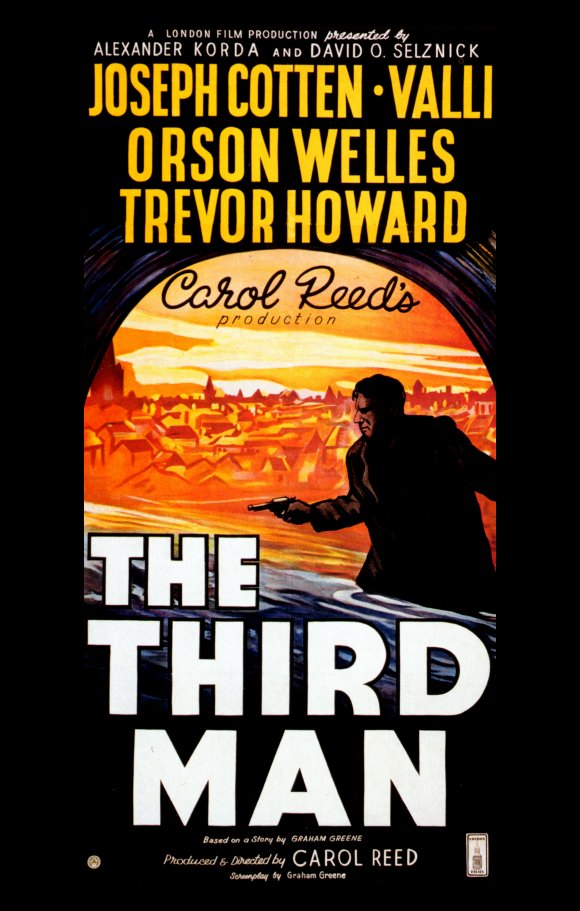
"The Third Man" (1949)

Scarface (1983)

The Untouchables (1987)

What Lies Beneath (2000)

Mulholland Drive (2001)

Swordfish (2001)

Along Came A Spider (2001)

Sin City (2005)

Max Payne (2008)

Law Abiding Citizen (2009)

I chose to do my film poster in the style of 'The Third Man' but wanted to photograph an image for my film poster in the style of the males on the posters of 'Brighton Rock' or 'The Third Man'. When I had my film poster shoot, I alternated the orientation of landscape and portrait and changed the position of the white light - which originated from an iPhone.
The original image I selected for my poster
I used Photoshop on the Apple Mac and added titles such as cast credits, film title, tagline, institutional information and date of release in Impact font.
I further researched conventions of film posters by researching independent film festivals. Independent film festival recognition is found on any independent film poster. While researching I came across Bird's Eye View Film Festival which is based in London and recognises the achievement of women directors - I felt this to be an extremely apt Film Festival to include on my film poster.
Bird's Eye View Film Festival logo
I uploaded the image onto Photoshop and changed the colour of the logo to orange as I felt orange suited the colour scheme of my film poster better. I researched the categories of awards and felt that the Best Newcomer award was most suited for my film so I added the words 'Best Newcomer 2012' in orange font below the orange logo and changed the white background to black. I then copied and pasted this onto my film poster
I also found through my research that Cannes Film Festival presents the Palme D'Or for Short Film Award. I searched an image of the logo for this award, which is used on winners' film posters:

The Cannes Film Festival Palme D'Or Award for Short Film
I uploaded this image onto Photoshop and changed the colour of the font to red. I then changed the background to black and used the paint bucket icon to fill in each gap of the Palme D'Or logo and the words below the logo. After I had done this I copied and pasted the new image to my film poster, which was now complete.

Final film poster
No comments:
Post a Comment